Illustration
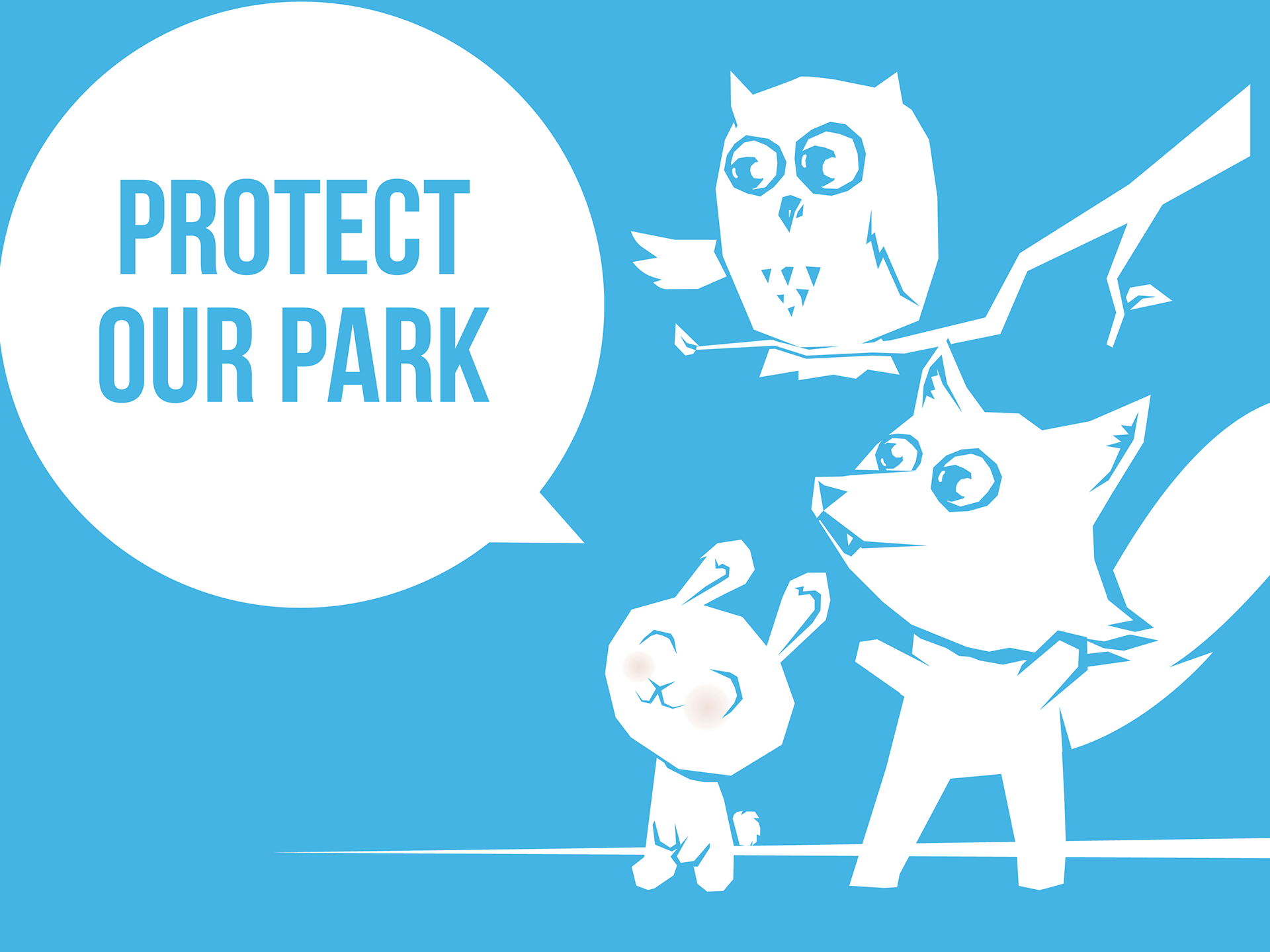
Protect Our Park
OVERVIEW
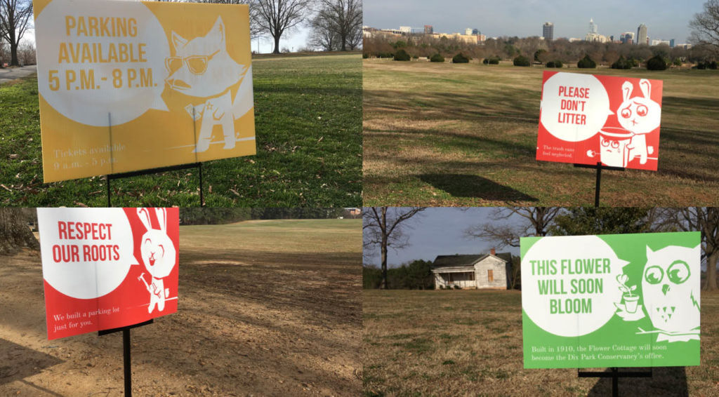
The City of Raleigh project required approximately two dozen semi-permanent signs while the park undergoes transformation into a world-class park destination.
TASK
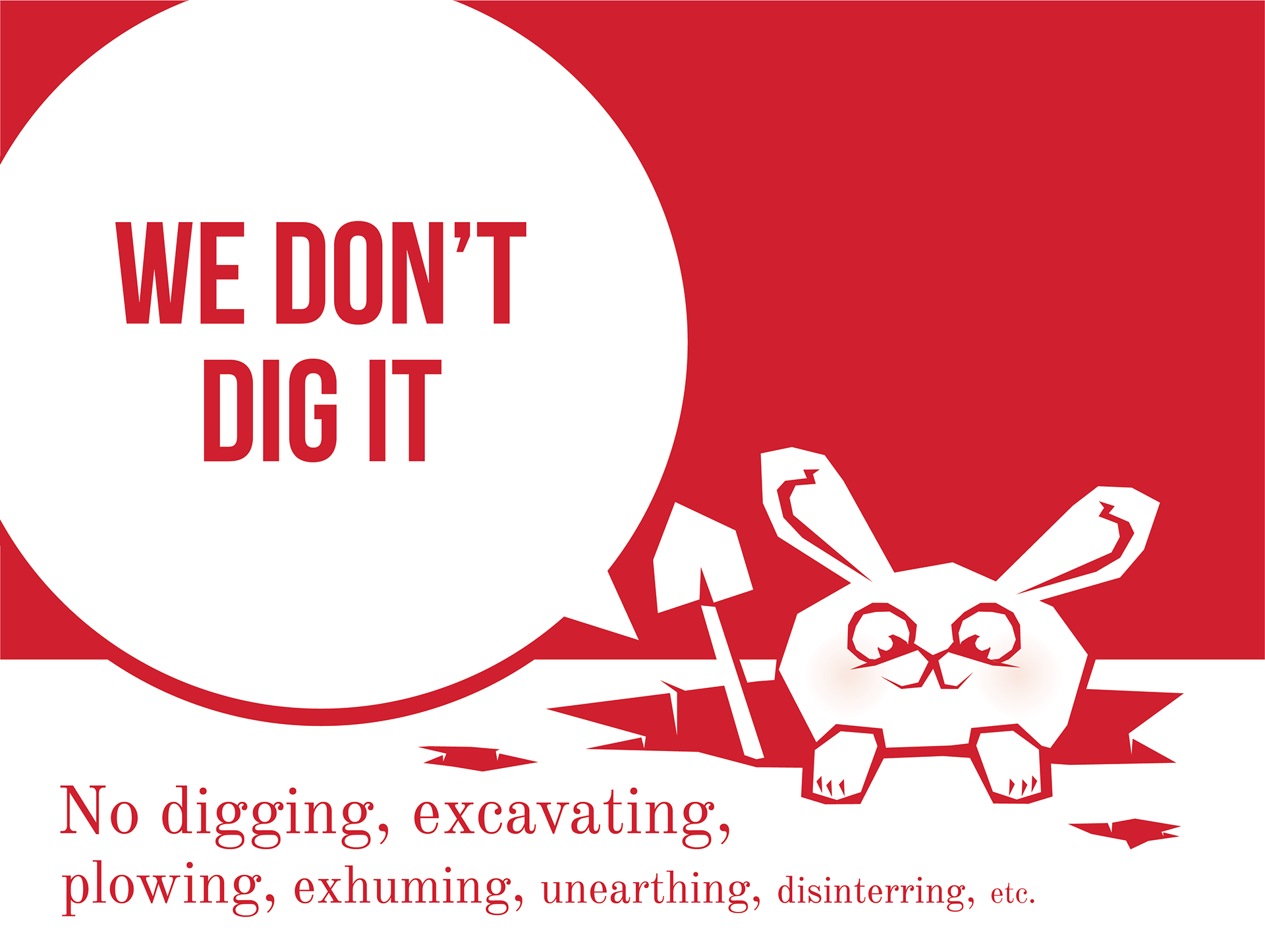
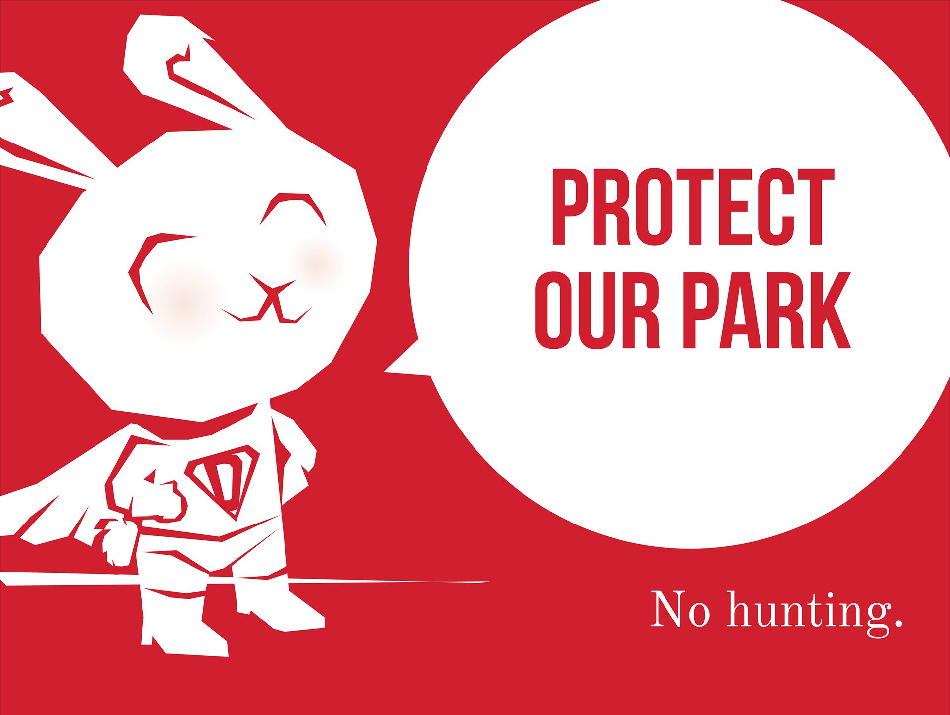
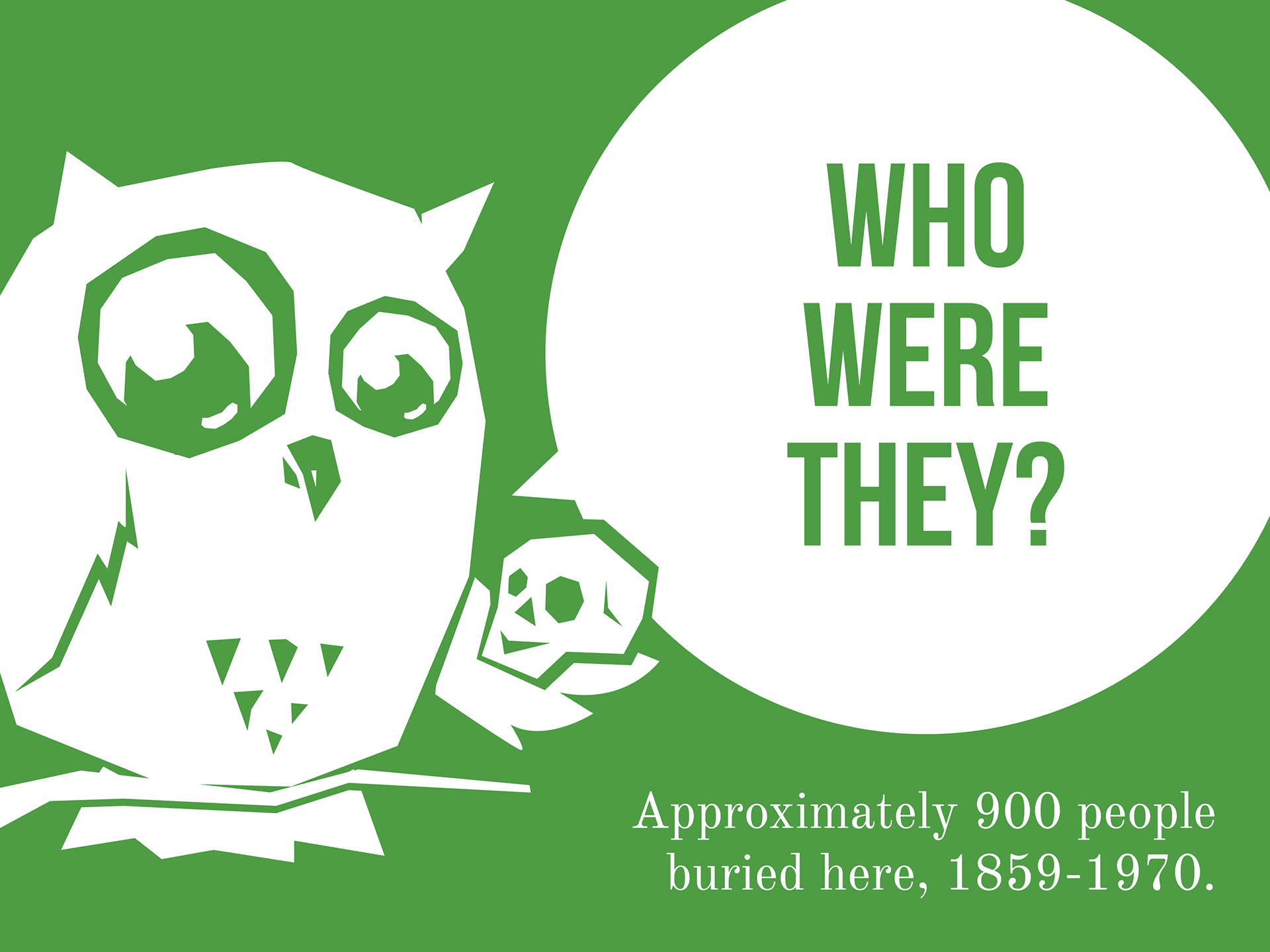
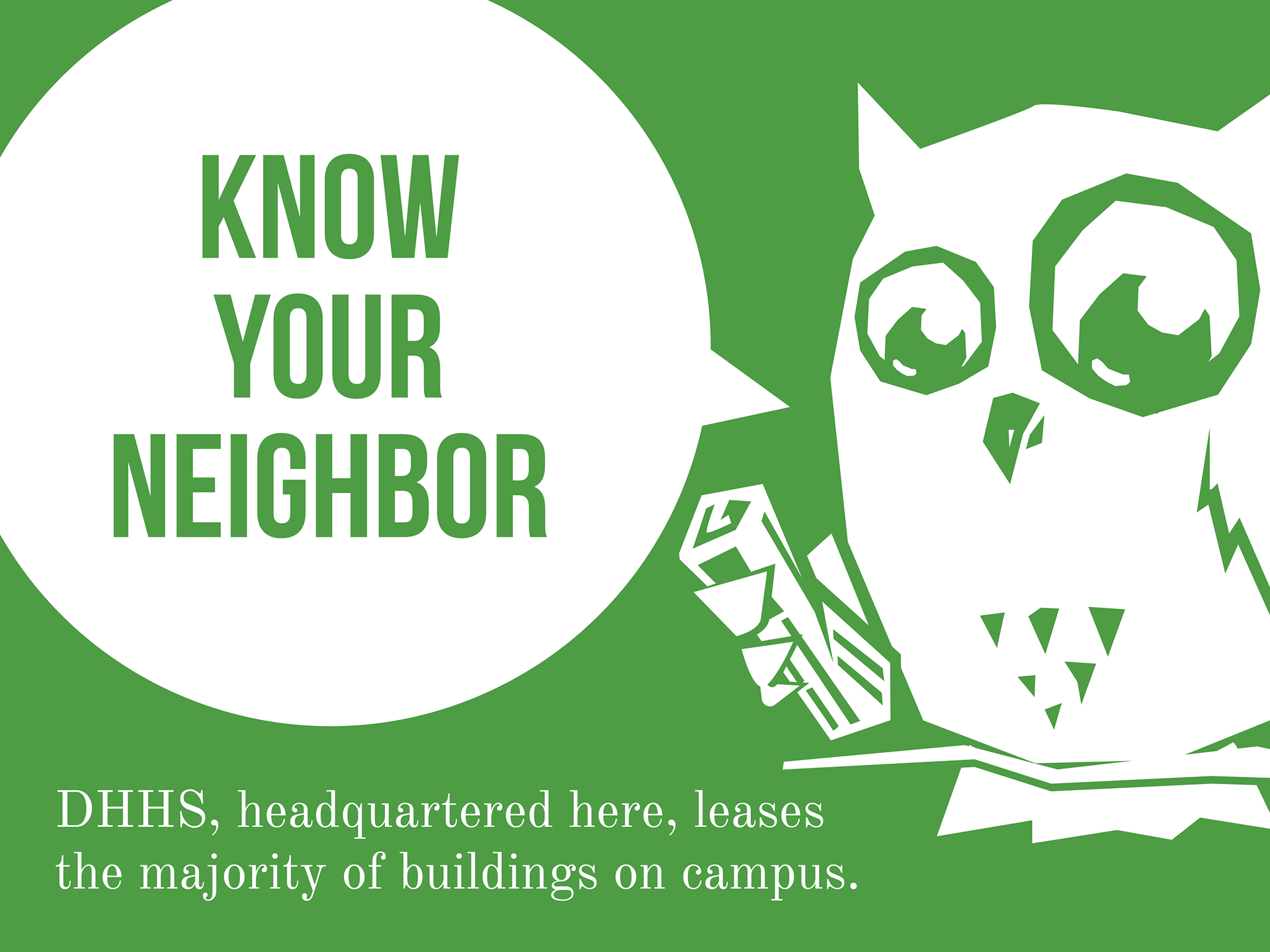
Myriad Media asked me to create a series of playful, explanatory way-finding signage for the City of Raleigh's recently acquired Dix Park.
EXECUTION
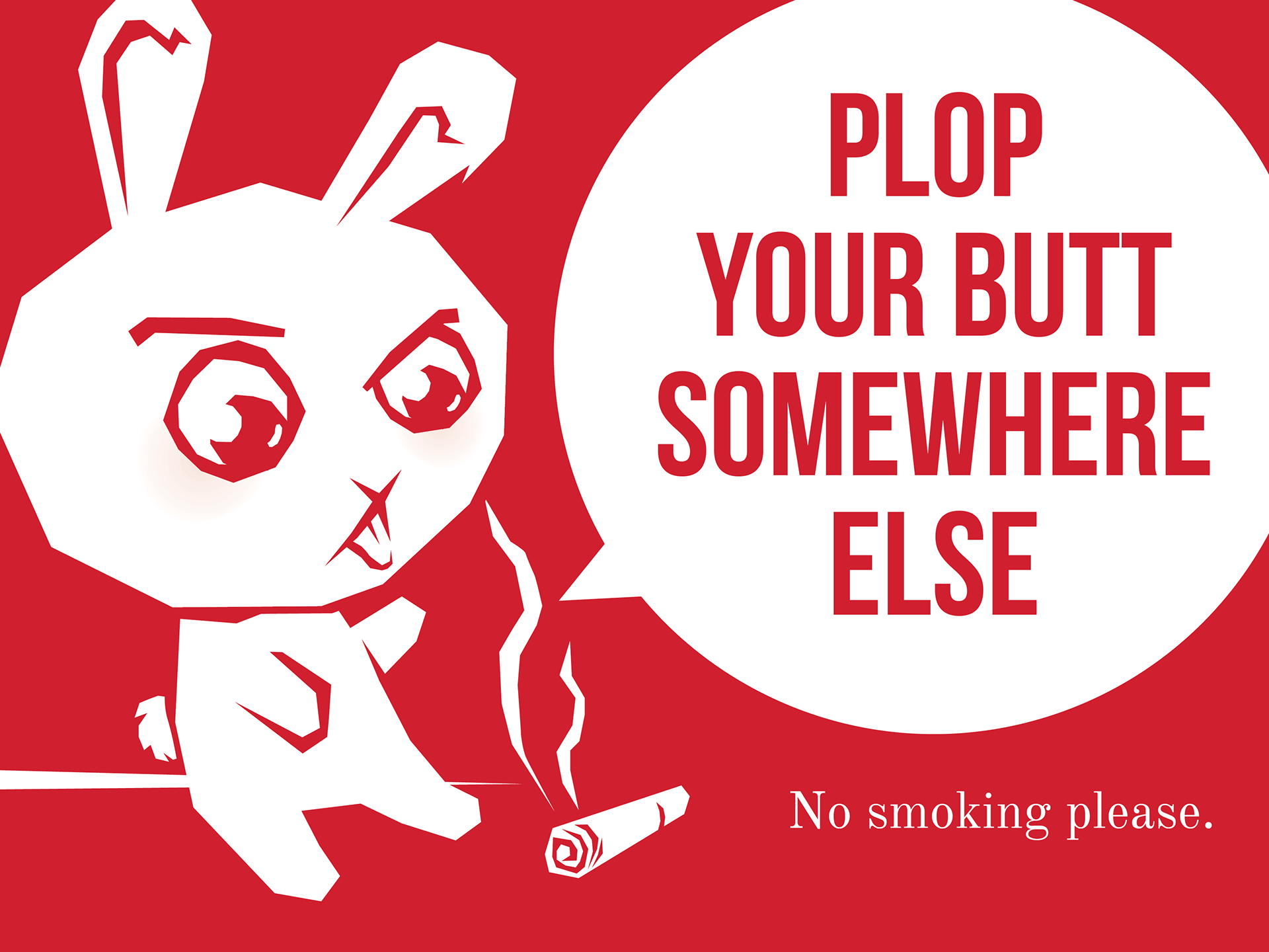
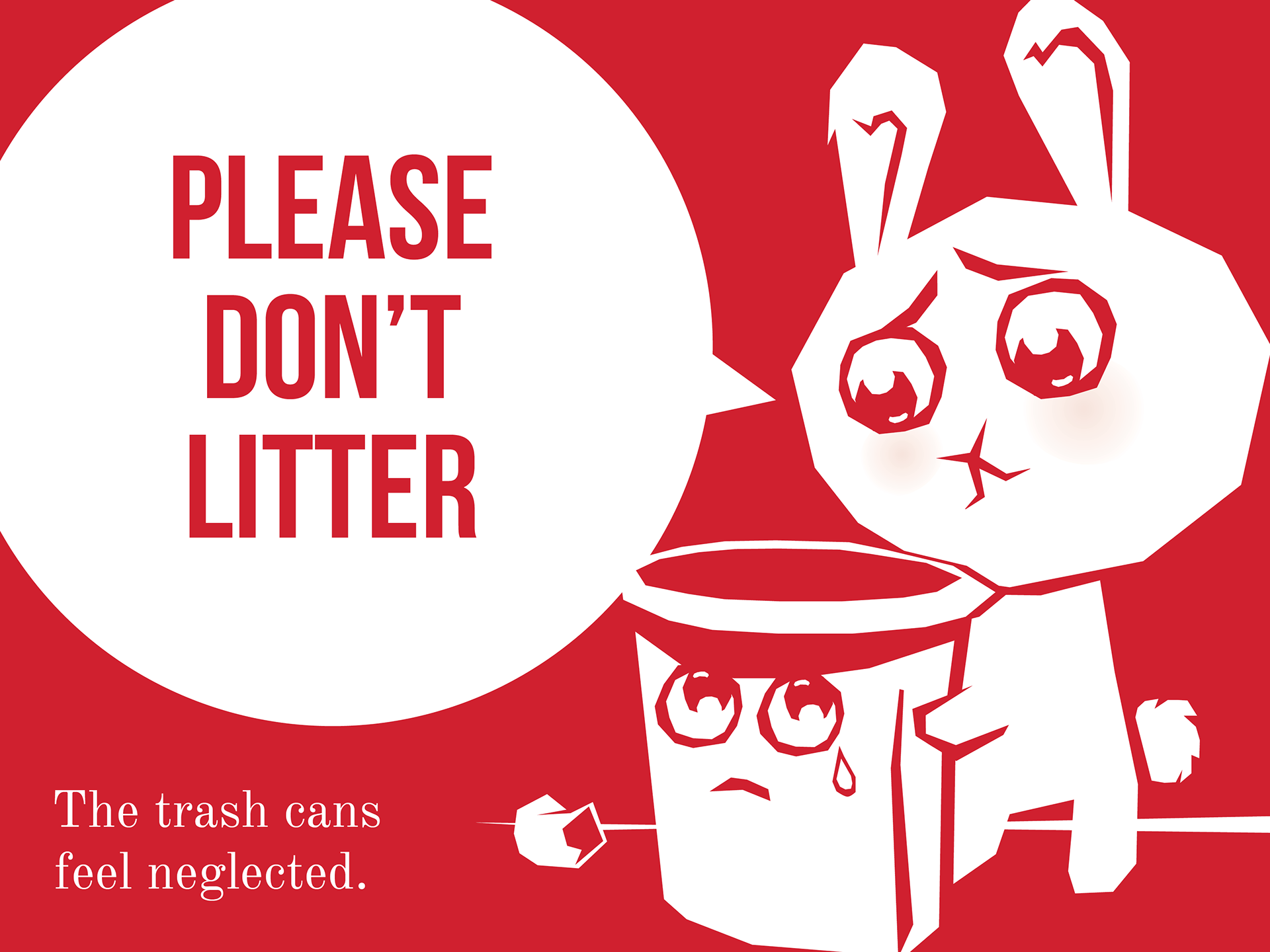
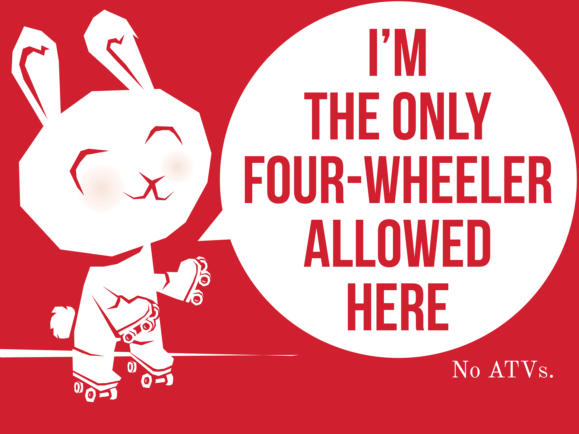
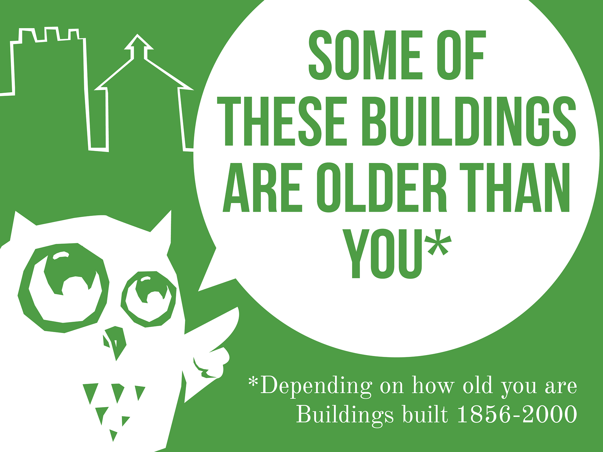
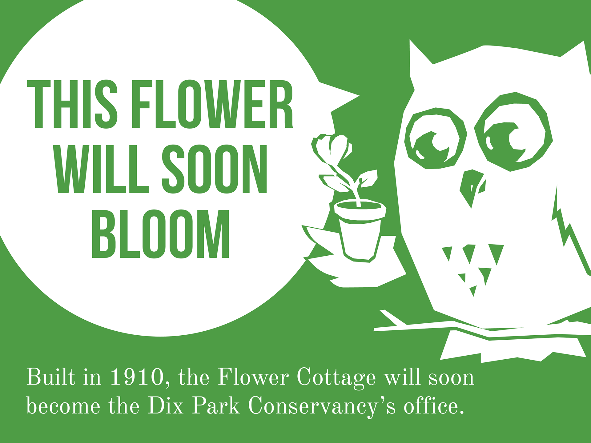
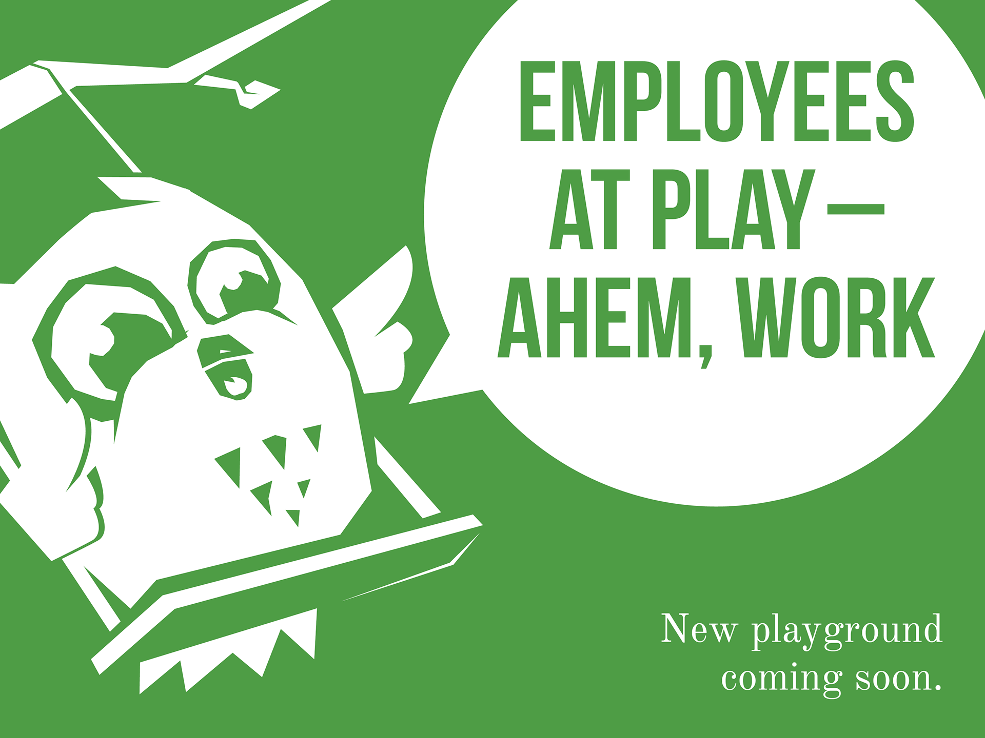
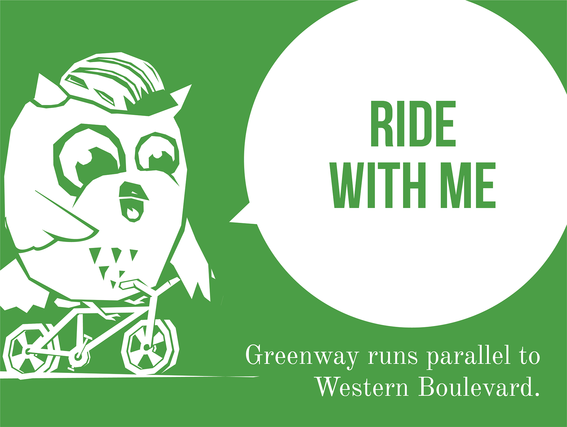
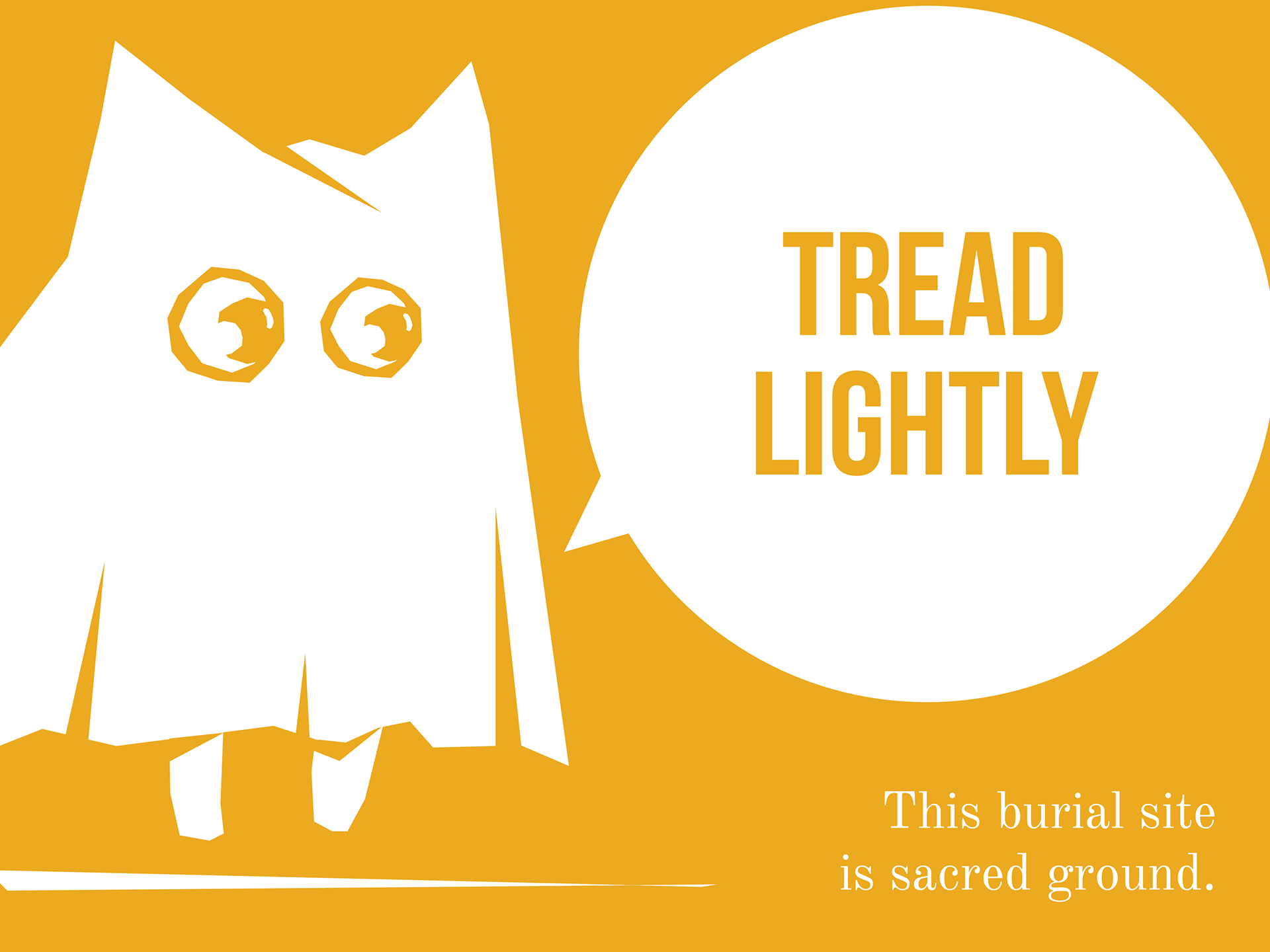
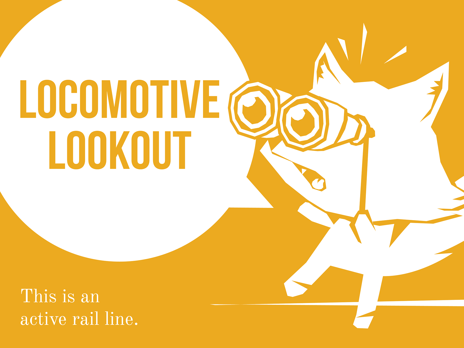
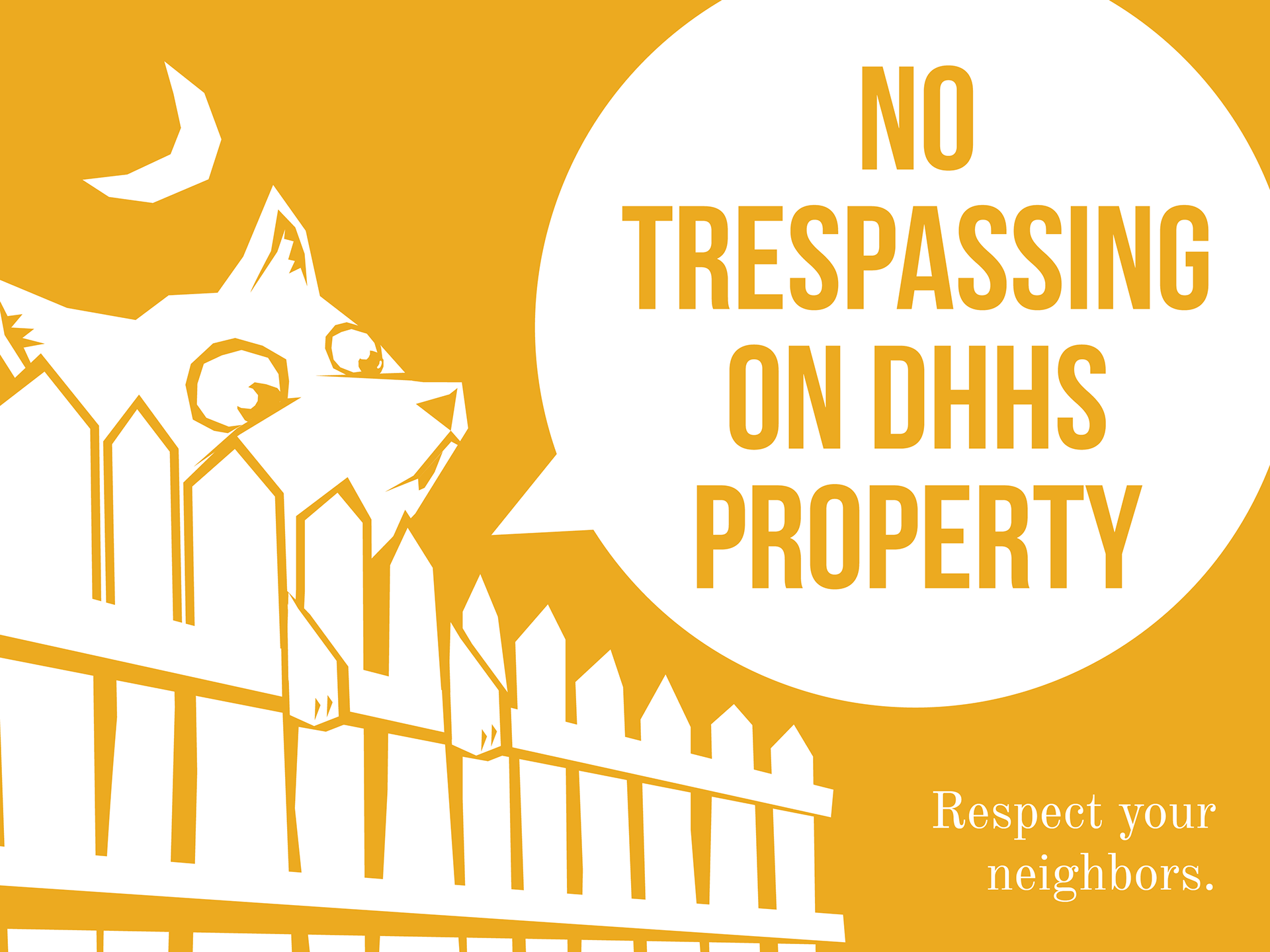
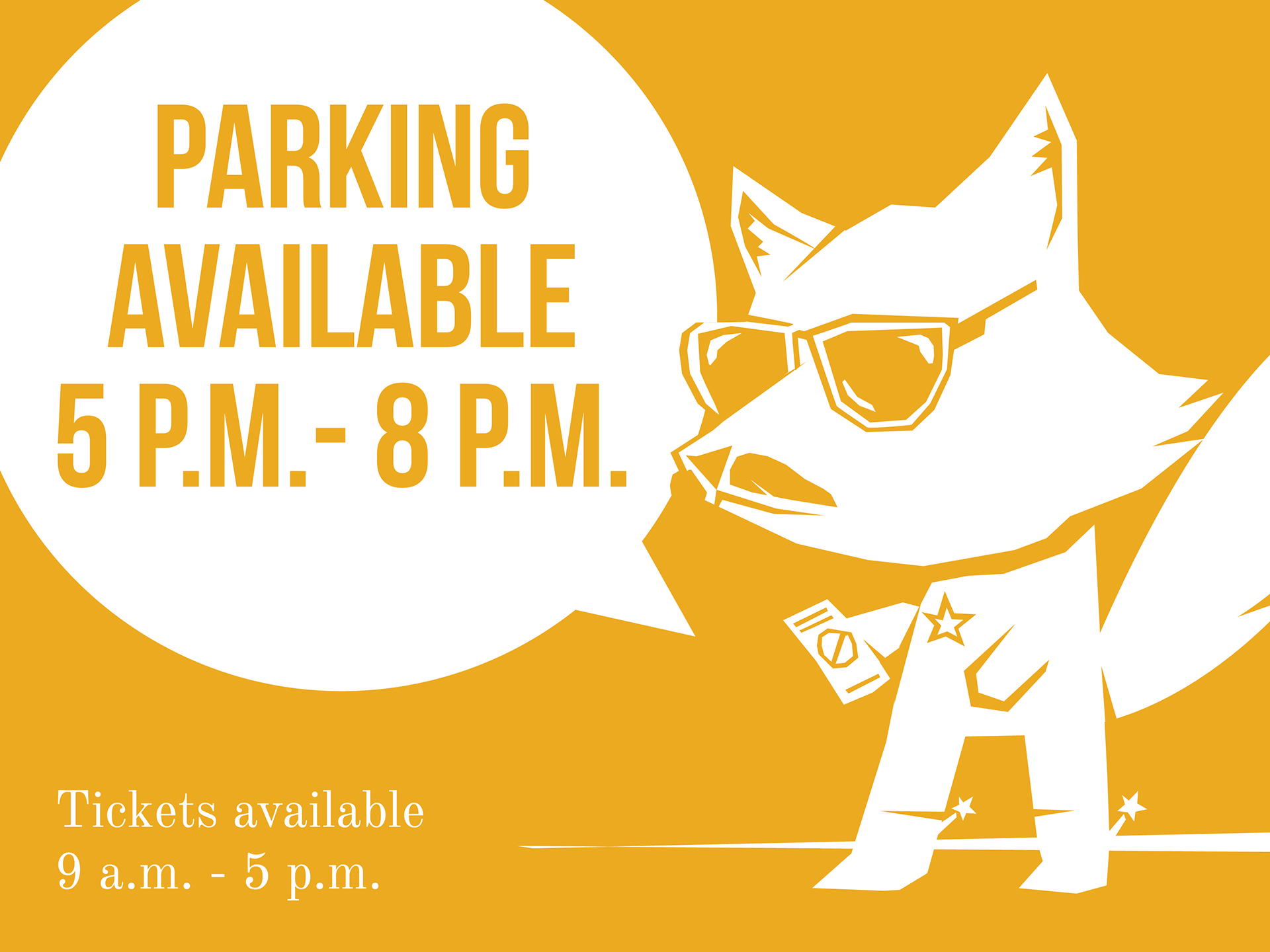
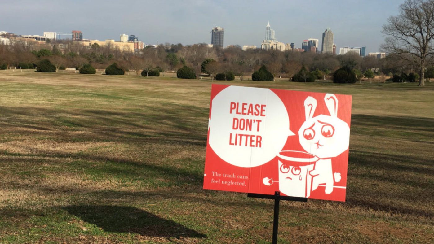
I illustrated a recognizable family of mascots—with a little attitude—for the City to use at Dix, and future projects at other city-owned park spaces. The signs were organized in three categories: Red for things park visitors should not do, like litter; yellow for cautionary statements, like watching out for trains; and green for interesting facts or tidbits about the park. Each color was assigned its own mascot to create a subtle visual clue tying each sign together. The signs were then installed around the park with metal housing, and shared online using the hashtag #ProtectOurPark.
Photos courtesy of Myriad Media
